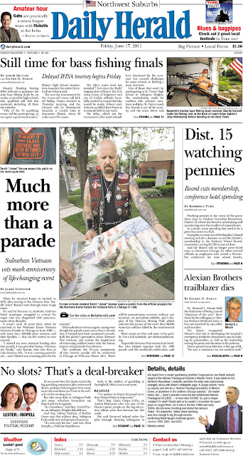
Well, when it comes to a headline for your dominant story on your front page or section fronts, don't be afraid to "go big" with your headline typeface size.
In my review of several daily and weekly publications throughout ACM, I have noticed that many of our newspapers tend to run their headlines too small both on the front page and inside the paper.
The days of waiting for a war story to run a headline 60, 70 or 80 points are long gone.
Big headlines draw big attention, even if the story is about a new trash collection service in your town that is being disputed by the public.
Don't be afraid to run a headline that says, "Resident trash city's decision" in 60-point type.
Headlines serve two purposes — to summarize the report, and catch the reader's attention. A 36-point headline on the top of A1 will not do the latter.
Please see the examples below of large headlines on page A1s of newspapers posted on Newseum today:
Below are examples of newspapers who are running their main headlines too small:


No comments:
Post a Comment